Using CSS3 Transforms to Manipulate Page Elements
by Sue Smith

With the advent of CSS3, web design is beginning to benefit from a significantly improved range of styling options. With HTML5 and CSS3, you can implement relatively sophisticated graphic effects natively within your web page code – no plugins or static images needed. CSS3 transforms allow you to manipulate visual page elements, moving, scaling, rotating and skewing them. Although it is tempting to jump in and start maximizing on these effects, it is essential to be aware of the many browser compatibility issues that still remain, making sure you take care of all users who access your site, regardless of which browser they are using. In this article, we'll touch on the full gamut of possibilities and limitations.
There's a demo at the end of the article that incorporates all of these effects; you might want to open it now.
Preparation
Let's get started. Prepare an HTML5 page outline using the following sample markup:
<!DOCTYPE HTML>
<html>
<head>
<style type="text/css">

</style>
</head>
<body>

</body>
</html>
We will use an image element to demonstrate the CSS3 transforms, so add one to the body section of your page as follows:
<img class="pic" src="nice_picture.jpg" alt="nice_picture" />
We will use the class attribute to identify the image in CSS. Alter the source attribute (src="nice_picture.jpg") to reflect the name and location of your own image if you have one you want to use. Otherwise you can download this one:

We will explore a variety of transform options. In general, the CSS3 transform property is supported by all of the recent versions of each major browser, including Internet Explorer 9, Firefox 3.5, Chrome 4.0, Safari 3.1 and Opera 10.5. However, this still leaves a substantial portion of your potential users whose browsers will not support the transforms, so it's best not to use designs that are reliant on them. It's advisable to only implement the transforms as an optional extra design feature.
Translate (Move) the Picture
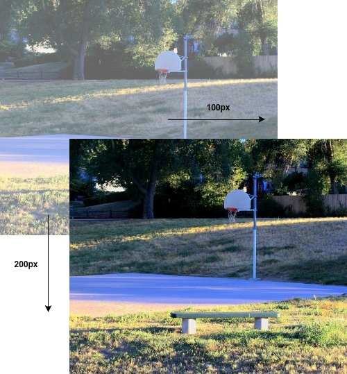
First let's use the translate transform to move the element. The translate transform moves an element along the X and Y axes by a specified amount in each direction. This is the basic syntax:
transform: translate(100px, 200px);
This indicates a translation of 100 pixels to the right along the X axis and 200 down the Y axis. First we specify that the declaration is a transform, then we indicate the type of transform, in this case translate, along with parameter values indicating the amount of distance we want to translate the element. Looks fairly straightforward, however, at the moment the reality of using CSS3 transforms is a little more complex.
We talked a little bit about vendor prefixes when discussing drop shadows; for transforms, we need even more vendor prefixes (joy!). Within a CSS block, you must supply not only the standard syntax version, but also alternative declarations tailored to the various browsers. Add the following to the CSS section of your page:
.pic {
   /* Firefox */
   -moz-transform: translate(100px, 200px);
   /* WebKit - Chrome and Safari */
   -webkit-transform: translate(100px, 200px);
   /* Internet Explorer 9 */
   -ms-transform: translate(100px, 200px);
   /* Opera */
   -o-transform: translate(100px, 200px);
   /* general syntax (IE10, probably others soon) */
   transform: translate(100px, 200px);
}
As you can see, things get a little messy when trying to accommodate the different browsers. I've commented each line to note the browser at which it's targeted. The vendor prefixes are an unfortunate requirement, but if you look at the detail you'll see that the code for each browser type only varies slightly – just the prefix changes.
Save your page and open it in a supporting browser to see the effect. You should see the image moved to the right and down the page. If you are using your own image, you may wish to alter the translation values with its size in mind.
So, what are translation transforms useful for? Among many possibilities, they are often used in combination with CSS animations and scaling to add creative hover effects to elements.
Note: If your image element is within a parent element with a fixed size, you can optionally supply relative values to the transform, such as percentages. To move the element to the left or up the page, simply supply negative parameters to the translate declaration. If your page contains other elements, the translation may cause the element to overlap with them, in which case you may need to supply additional CSS declarations such as margins.
Rotate the Picture

The rotate transform allows you to rotate elements by a fixed number of degrees. To rotate clockwise we use a positive value; to rotate counter-clockwise we use a negative value. Alter your code as follows to see the rotate transform in action:
.pic {
   /* Firefox */
   -moz-transform: rotate(90deg);
   /* WebKit - Chrome and Safari */
   -webkit-transform: rotate(90deg);
   /* Internet Explorer 9 */
   -ms-transform: rotate(90deg);
   /* Opera */
   -o-transform: rotate(90deg);
   /* general syntax (IE10, probably others soon) */
   transform: rotate(90deg);
}
Notice that the code is very similar to the previous example; the properties are the same, with only the value portion (the part after the colon) changing to suit the type and detail of the transform. Test your page again and try experimenting with a negative value to see the effect.
As well as rotating elements to a fixed position, the rotate transform can be used for 360 degree rotation, unfolding over a timed interval using transitions (as we will explore later). Since the rotate transform can be used to present multiple showcase or informative images rotated to specific angles, it is perfectly suited to image galleries – for example, to create interactive piles of virtual polaroid-style photographs.
Scale the Picture
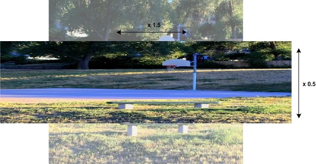
The CSS3 scale transform lets us scale webpage elements, making them bigger or smaller by relative amounts. This is naturally more suited to vector types, particularly SVGs (Scalable Vector Graphics), as they do not lose quality when scaled. However, you can use the effect with any image or other element you like. Alter your transform code as follows:
.pic {
   /* Firefox */
   -moz-transform: scale(1.5, 0.5);
   /* WebKit - Chrome and Safari */
   -webkit-transform: scale(1.5, 0.5);
   /* Internet Explorer 9 */
   -ms-transform: scale(1.5, 0.5);
   /* Opera */
   -o-transform: scale(1.5, 0.5);
   /* general syntax (IE10, probably others soon) */
   transform: scale(1.5, 0.5);
}
The values indicate an amount to scale the element along the X and Y axes – in this case, it will be one and a half times the width and half of the height. To scale to a smaller size, use a value less than 1; to scale to a larger size, use a value greater than 1.
Scale From Where?
Open your page again to test it. Notice that when you scale an image, its central point remains the same. This is where the transform-origin property comes in. If you need your transforms to use a different point of origin, i.e. not the center of an element, you can set it as follows:
transform-origin: top left;
This is the standard syntax for using the top, left point of the element as the transform origin. This means that the top left corner of the element remains in the same position after the transform has been applied. You can supply left, center or right for the X-axis origin with top, center or bottom for the Y axis. The transform-origin property can also optionally take percentage and fixed-length values.
Just as with the transform declaration itself, we have to use vendor-specific versions of the transform-origin property for full browser compatibility:
.pic {
   . . .
   /* Firefox */
   -moz-transform-origin: top left;
   /* WebKit - Chrome and Safari */
   -webkit-transform-origin: top left;
   /* Internet Explorer 9 */
   -ms-transform-origin: top left;
   /* Opera */
   -o-transform-origin: top left;
   /* general syntax (IE10, probably others soon) */
   transform-origin: top left;
}
As mentioned above, scaling is particularly useful in conjunction with vector images such as SVGs. When you scale these types of images, they retain quality; this means you can create designs that are tailored to particular device and screen sizes and adapt to suit the user environment, all without having to use different image resources. The scale property is also useful if you want to make an element change size when users roll the mouse on and off of it – for example, for menu item interaction.
Skew the Picture
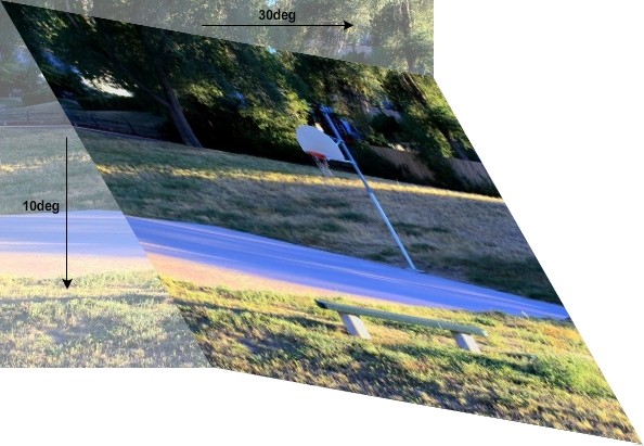
Let's have a go at skewing the image now. Here's what this allows:
To apply this effect, alter your CSS code as follows:
.pic {
   /* Firefox */
   -moz-transform: skew(30deg, 10deg);
   /* WebKit - Chrome and Safari */
   -webkit-transform: skew(30deg, 10deg);
   /* Internet Explorer 9 */
   -ms-transform: skew(30deg, 10deg);
   /* Opera */
   -o-transform: skew(30deg, 10deg);
   /* general syntax (IE10, probably others soon) */
   transform: skew(30deg, 10deg);
}
The values apply skewing along the X and Y axes, to the right and down the page. Again, to skew to the left or up, simply supply negative values – e.g. -30deg instead of 30deg. Test your page again to see the result.
Skewing appears in many applications using emerging CSS3 techniques, often in conjunction with 3D transforms. Typical examples include interactive books and virtual cube-shaped objects, with the skew transform creating the impression of 3D movement.
Enhance the Transforms
So far so good; but the transforms we have explored so far don't seem particularly useful. In most cases, transforms are used in conjunction with other transforms, other CSS properties and with JavaScript functions prompted by user interaction. Let's briefly explore using JavaScript and additional CSS to enhance our transforms.
To see how JavaScript and the addition of a CSS3 transition can animate your effects, first remove the class attribute from your image element markup. This means that when you view the page now, the CSS transforms will not be applied. Also add a JavaScript onclick event attribute as follows:
<img src="nice_picture.jpg" alt="nice_picture" onclick="toggleClass(this, 'pic')" />
When the user clicks the image, the toggleClass JavaScript function will be executed. Add it to the <head> section of your page as follows:
<script type="text/javascript">
function toggleClass(element, classString)
{
   if (element.className == classString)
      element.className = '';
   else
      element.className = classString;
}
</script>
If you're new to JavaScript, this code simply sets the element's class attribute, with the same effect as including the attribute within the HTML markup for the element (as we did before). Setting the class – via the class attribute or via JavaScript – applies the CSS declarations listed for the class. In other words, we only apply the transform when the user clicks the image. Passing the class name and element as a parameter gives you the flexibility to use this function with various classes and elements in your page. Save your page and reload it in a browser to test it; the transform effect should be applied immediately on clicking the image. Clicking again will revert the image to its original state.
Now let's enhance things a little further by animating the transform, using transitions. In the CSS section, add the following:
img {
   /* Firefox */
   -moz-transition: all 3s;
   /* WebKit - Chrome and Safari */
   -webkit-transition: all 3s;
   /* Opera */
   -o-transition: all 3s;
   /* general syntax (IE10, probably others soon) */
   transition: all 3s;
}
This code means that when the transform (or any other CSS property) is applied to your element, via the user clicking or otherwise, the browser will implement the change over a period of 3 seconds. The all part indicates which properties the transition applies to; this can be used to specify transitions for only certain properties, or different transitions for different properties. Note: Transitions are not yet supported in Internet Explorer, but version 10 is set to provide this support soon.
Open your page to test it. Click on the image element to see the transform execute over the specified period of time. Click the image again and it should return to its original position, also over the course of three seconds.
Try It Out!
Check out the demo for this tutorial to see all of the effects in action. Notice that with some of them we use additional CSS properties, for example moving an element at the same time as transforming it. This is done by listing more than one transform as part of the same declaration. Feel free to look at the demo page's source code to gain a better understanding of how these effects work.
Advanced Topics
If you would like to explore CSS3 transforms further, there are many possible topics to look at. The matrix transform uses six values to define mathematical matrix transformations on your elements. There are also a range of 3D transformations, allowing you to manipulate elements on the Z axis in addition to the X and Y axes. Browser support for the 3D transforms is more limited, with only the most recent versions of Firefox and the WebKit browsers supporting them (Internet Explorer support is coming in version 10).
Conclusion
CSS3 transforms are starting to give a real insight into the design and interaction options we can look forward to as browsers continue to mature. Rather than relying on third-party tools such as Flash, you will be able to add interactive multimedia to your page via HTML markup, CSS rules, and JavaScript scripting. This will ultimately mean a much more accessible, consistent and reliable experience for your users.
At the moment, you do unfortunately have to temper any excitement with a little caution, as browser support still has a long way to go. If you are including CSS3 transforms in your sites, make sure you accommodate those users who will not be able to see them. A simple but effective approach for purely decorative transforms is to keep elements in their original position even as you apply transforms; this way, the user experience will remain relatively consistent across browsers where the transforms aren't applied.
Have fun experimenting with CSS3 in your designs!